


U.S. Housing 2025: The Bubble to End All Bubbles

The U.S. housing market is in a massive, unsustainable bubble that has overshot every measure of fundamental value. Home prices have soared far beyond what wages or rents can justify, mortgage rates have rocketed, and inflation is roaring alongside Trump’s 2025 tariff policies. In this expanded breakdown, we will cover the key data points exposing this bubble — price-to-wage, price-to-rent, affordability, inflation expectations, and, now, a look at the yield curve via the 10Y–2Y spread.
If you’re not paying attention now, you risk being caught off guard when a 35–40% market correction shatters your assumptions about home prices forever. Don’t be left in the dark when the bubble bursts. Subscribe for exclusive, unfiltered analysis that cuts through the fluff and prepares you for the inevitable reset. Your financial future depends on understanding these warning signs before it’s too late.
When Prices Outpace Wages
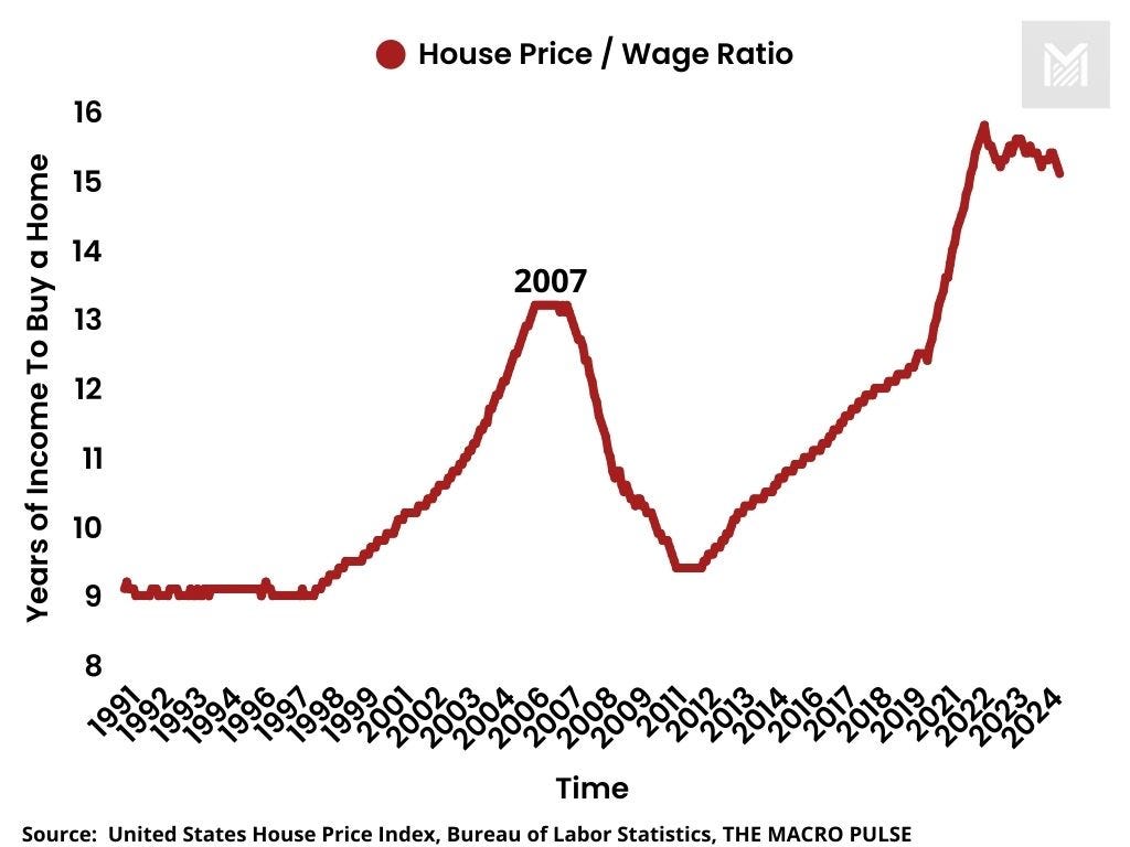
Figure 1: House Price/Wage Ratio (1991–2024)
This historical chart shows how many years of median income are required to purchase a median-priced U.S. home. The ratio was roughly 8 to 9 years in the early 1990s. It jumped to about 13 years at the peak of the 2000s housing bubble. Today, we see an even higher 15 years, a stark sign that housing prices have detached from the reality of American incomes.
When it takes 15 years of your wage to afford a home, you have a recipe for a massive correction. History shows that once valuations drift too far from incomes, the market eventually snaps back, often violently.
Prices vs. Rents: The Gap Widens
Keep reading with a 7-day free trial
Subscribe to The Macro Pulse to keep reading this post and get 7 days of free access to the full post archives.